If you're a tech savvy, computer aware person, you probably spend a bit of time doing tech support - helping friends and families with general PC problems . You've probably experienced the kind of guru-like awe and reverence that you're viewed with when you quickly solve a problem by breezing through a thousand unrelated options. For us nerds, it's not so hard - just a case of knowing the behavior, and the conventions, allows us to pick our way through even completely foreign application with relative ease.
For the rest of the world, Computer use is something of a dark art. User interfaces are complicated. Designing such complexity for an untrained human to use is really hard. Of course, Software Engineers are frequently not great at it, which doesn't help.
Jan Miksovsky's post, (via The old new thing), got me thinking about an old idea I had to try and visualize the complexity of a user interface. I call them 'decision trees' ( I apologize in advance if these already exist) Basically, the idea goes that you graph every option that you can present to the user in your interface. As Joel Spolsky says in his book on UI Design for developers - "Every option you add forces the user to make a decision. "
So I thought I'd have a go at trying to create one of these decision trees. I picked Windows Notepad, because it's a pretty simple application, and I'm lazy. I started to build the decision tree for Notepad, starting with the menu bar (because it contains nearly all of the options available to a Notepad user) After I'd finished the file menu, I decided that would be enough to illustrate my point. Check it out:
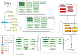
You can see that even one menu item of Notepad extends down to 5 branches. That's five levels away from the original decision to click on the file menu. Look how many possible paths the user could take! Imagine how complex a real application could get!
If your application is really designed for untrained users, optimizing your interface for a shallower decision tree should be your aim- such an interface should try to reflect the users intention as quickly as possible - this will make untrained users a lot more happy. In a way, this means you have to take a lot of power away from users, and make decisions for them. I think that Apple does a lot of this kind of stuff really well. (I love the way that the iTunes visualizer has one option - "on" or "off". )
So is a deep decision tree harmful? Maybe. If you are looking for an extremely high level of acceptance, (by nearly every class of user) the more decisions you present per user intention, the less likely it is the user will be delighted.
But if you have a specialist application, like Photoshop or Maya, a deep decision tree is unavoidable - at that point, the UI challenge is to find a sensible way to present complexity..
This is one of the problems that the new Microsoft Office 12 interface is trying to deal with, and the new ribbon interface looks like a really cool way to address it. (Much better than just hiding things, which was the approach taken in Office 10...)
So yeah, decision trees are an interesting reflective tool that you can use to determine how complex your user interface is. And the next time you give your baffled friend some tech support, remember that while the correct path may be apparent to you, he might be stuck in some unrelated part of the tree, floundering around with weird and unrelated options...
Update: Decision trees do indeed exist, as a tool of decision theory. Mapping a traditional decision tree like this to a user interface would take forever. Maybe someone should write a cool application that generates one..
nice blog. thanks
ReplyDeleteHi Gordon,
ReplyDeleteSaw you JoS post and checked out your blog. Very nice look, feel and content. And much to my surprise you are a fellow Ozy.
Battling UI simplicity is close to my heart, so the Decision Trees post was welcome read. I've written a few blogs posts on this you might find interesting: "Surfulater, Under the Hood and Down the Road" http://blog.surfulater.com/wordpress/?p=49 and "Creeping Featuritis" http://blog.surfulater.com/wordpress/?p=24